
Fitting Room
Project OVerview
Industry Trends
Low-Fidelity
Physical Prototype
The initial physical prototype of the fitting room kiosk was constructed using cardboard, an accessible and versatile material ideal for rapid prototyping.


Digital Prototypes

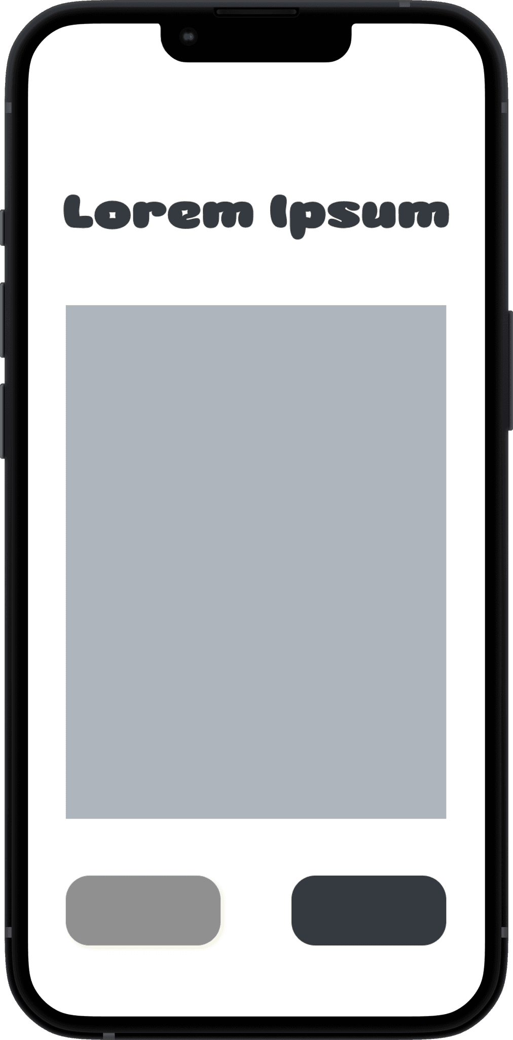


I started with a basic, low-fidelity digital model to layout the user interface and essential functionalities of the fitting room kiosk. This early version was crucial for mapping out the interaction flow and identifying key components.
While designing the high-fidelity version, mock-users experienced difficulties with the button interface. Their feedback highlighted issues with button accessibility and responsiveness, prompting a reevaluation of the user interface.


Peer Feedback
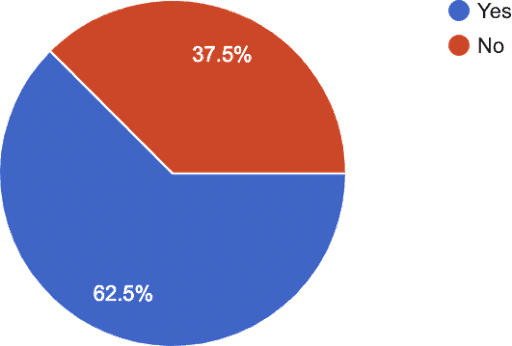
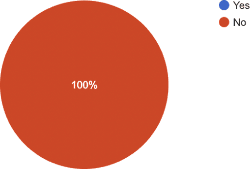
The design of the 'X' button received mixed reviews—some peers mentioned that the 'X' did not clearly resemble a button, while others found it adequate as it was.
To resolve these conflicting views and optimize the button's design, I decided to conduct preference testing. This method involves presenting users with multiple versions of the 'X' button design and collecting data on which version is preferred by users. This approach ensures that the final design will be user-friendly and visually appealing, catering to a wider audience.
User Testing


Qualitative Insights
Quantitative DAta
Click on each data point to explore its details! Scroll to the right to view additional data points.


Final Digital Prototype


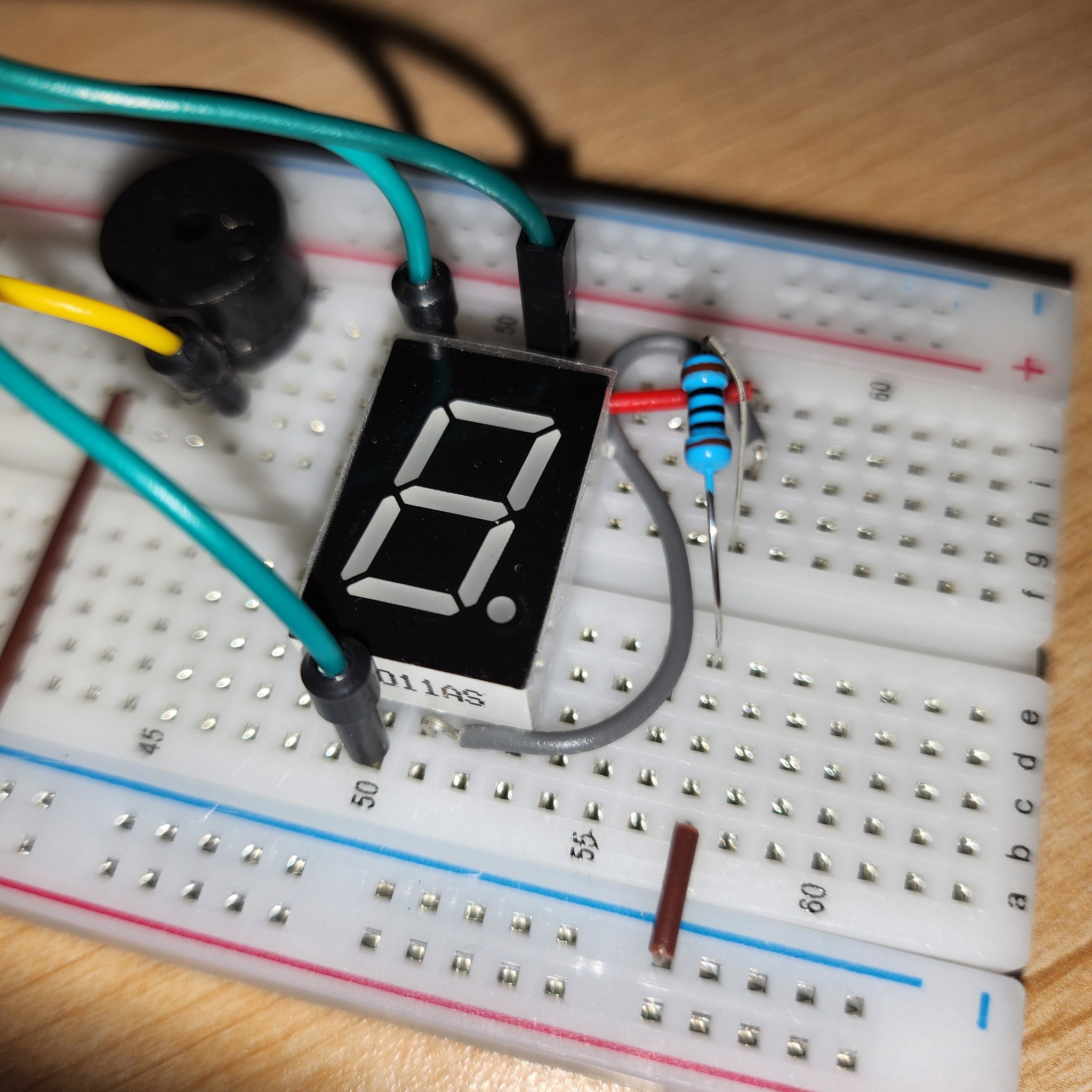
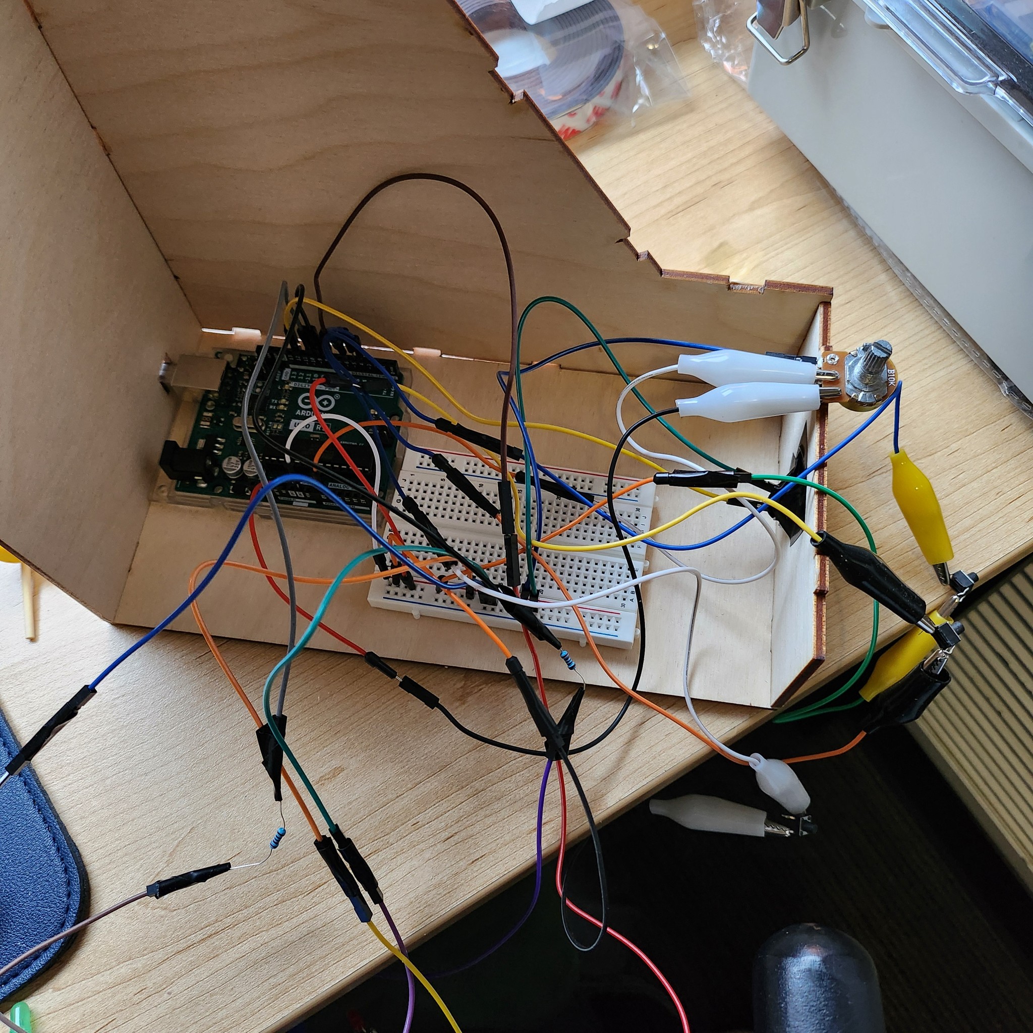
I programmed the Arduino to respond to button presses by activating the buzzer and chaning LED states, enhancing the tactile feedback for users. For instance, pressing the start button would trigger a specific sequence of LED flashes and a corresponding buzzer tone, indicating that the kiosk had initiated a process.
I also incorporated a potentiometer, allowing for real-time adjustments. The Arduino read the potentiometer's value, and based on the changes, adjusted the kiosk's digital display accordingly. This interaction was vital for creating a dynamic and responsive user interface.
Serial communication also played an important role in this setup, enabling seamless interaction between the Arduino and the kiosk's digital interface via ProtoPie. This allowed control based on user interactions collected by the Arduino. Commands from ProtoPie were also received by the Arduino to activate or deactivate LEDs, making the user experience fluid and integrated.
Arduino Wiring Diagram
I used three buttons, three LEDs with 220-ohm resistors, a B10K potentiometer, and a piezo buzzer. Although this diagram includes a 7-segment display on the far right, I thought it was unnecessary and chose not to use it in the final implementation.

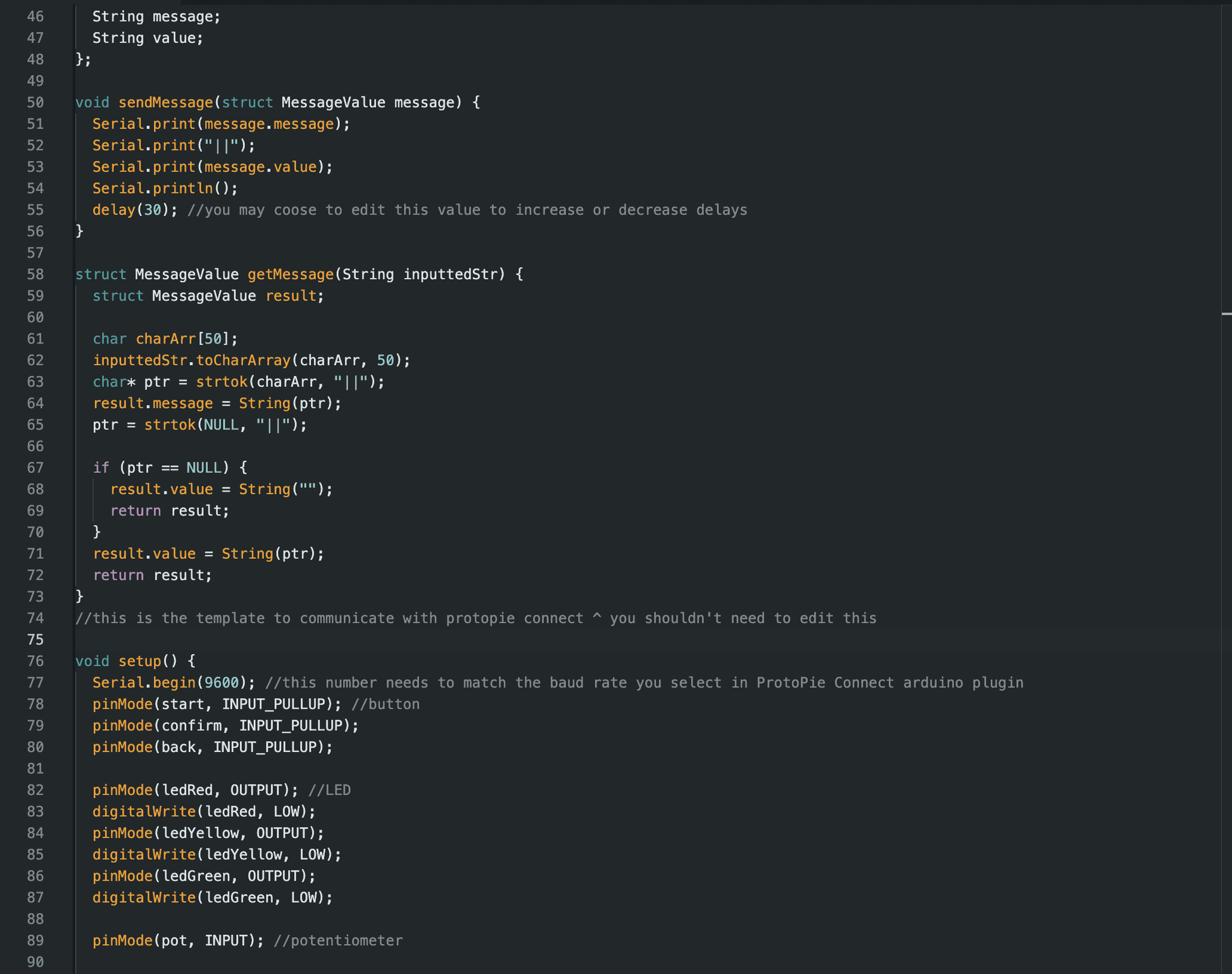
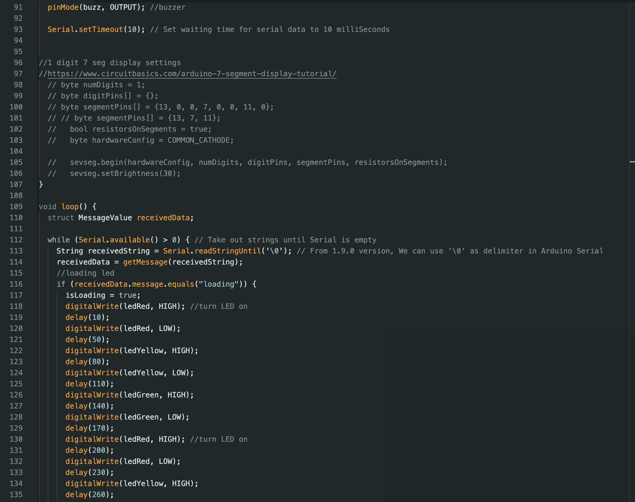
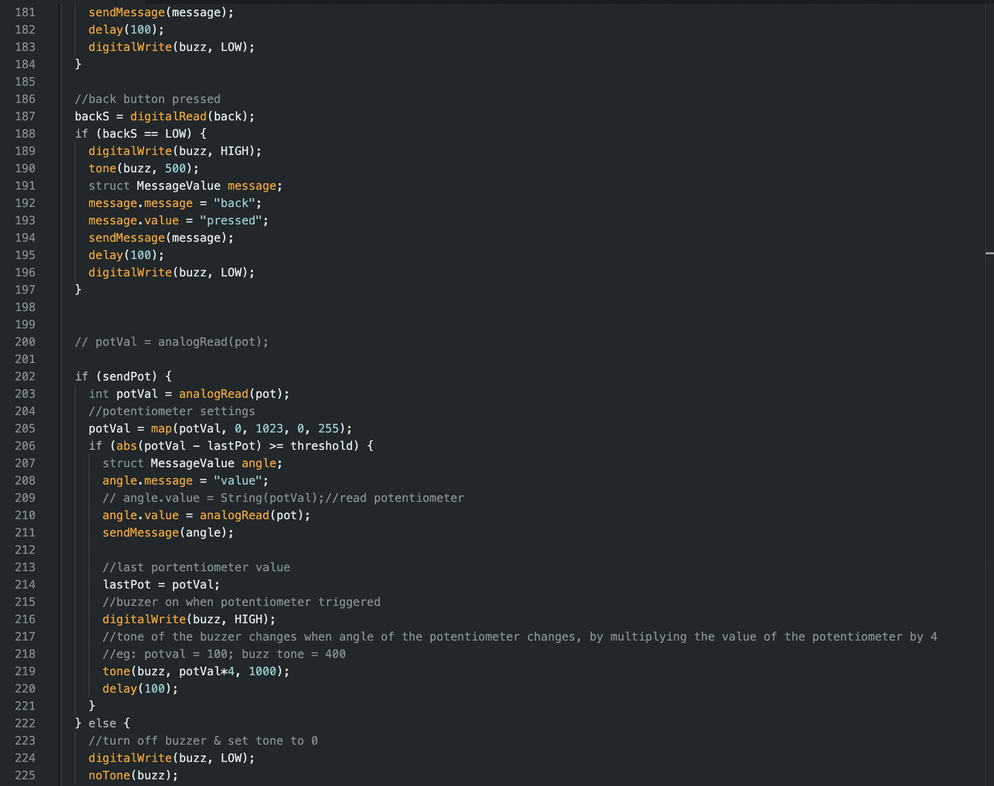
Arduino Code


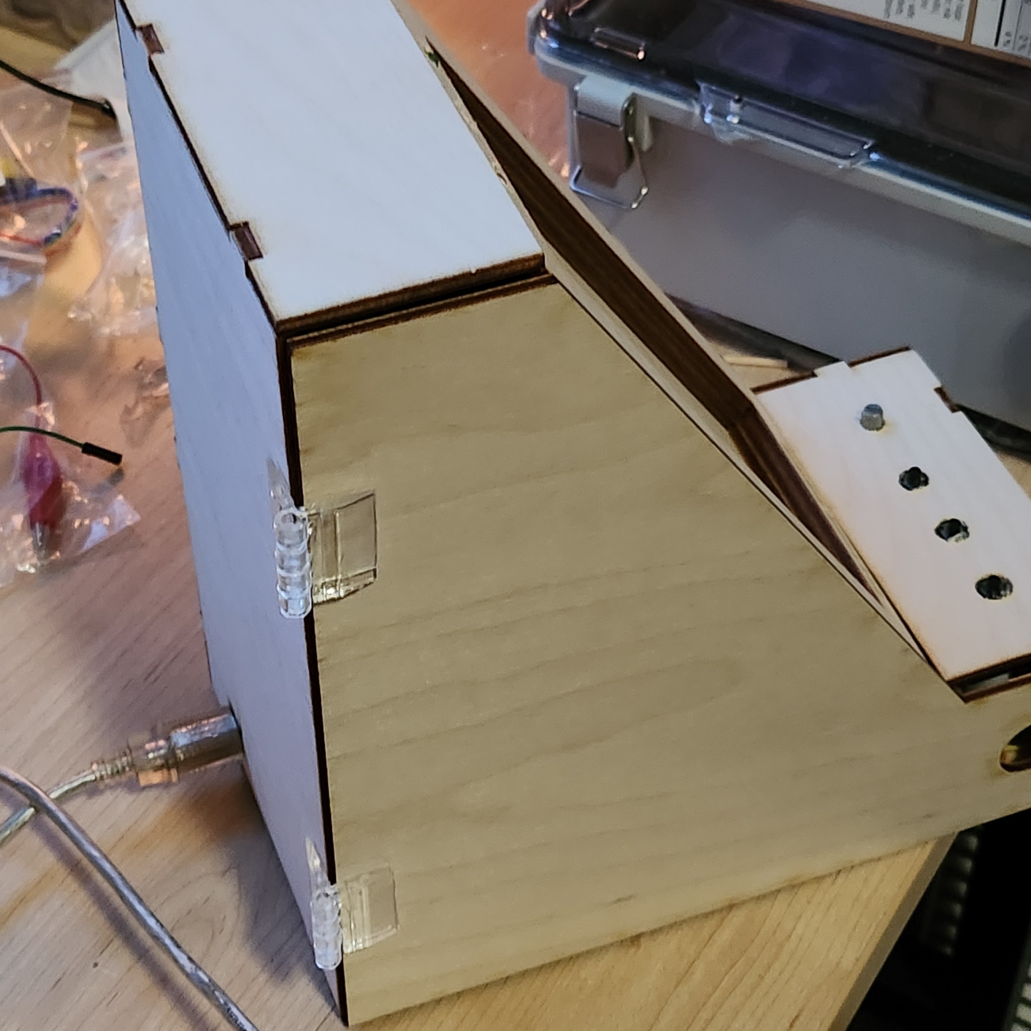
Physical Prototypes
Mid & high-fidelity physical prototypes


Final Design
Other Projects


©2025 Sejeong Seo.
Menu
Contact
I'm fascinated by Darwin's theory of evolution and curious about what humans will look like tens of thousands of years from now. When I was younger, the Earth had a population of around 6 billion, but now it keeps increasing, which worries me a bit. I wonder when humans will go extinct, and I'd like to hear in detail about the extinction process. I'm also curious about what Earth's ecosystem would be like without humans. If humans haven't gone extinct, I want to know what the new evolutionary processes might be, especially how human evolution might interact with the climate changes we are experiencing today.
If you want to discuss this further or have possible answers, please contact me via email.